/* Css En-Bref */
The world of neutral tones is as attractive as it is intriguing. Sometimes one imagines a dull decoration, lacking character, whereas in truth a subtle selection of grays, beiges, and creams reveals a palette rich in nuances. Between choice of materials, balance of contrasts, and play of textures, the neutral reveals all its finesse when you know how to enhance it.
Sommaire
Why choose a neutral palette?
At first glance, a neutral palette seems minimalist, almost austere. However, these tones offer an ideal backdrop to highlight shapes, bring objects to light, and make atmospheres resonate. The eye rests while remaining alert to the subtle contrasts that emerge.
A calming and adaptable setting
On a psychological level, neutral colors promote tranquility. In a living room, they invite relaxation without overstimulation, unlike bright reds or deep blues. Moreover, a neutral shade suits all seasons: accessorize it with a warm fiber throw in autumn, then with a lighter cushion when the warmer days arrive.
A backdrop for your standout elements
One might think that neutral decor erases objects, but it is quite the opposite: a caramel leather sofa or a metallic pendant light comes to life against a light beige wall. The discreet contrast lets each piece breathe and creates a visual focal point without disrupting the overall harmony.
Essential shades
More than just a selection of grays and beiges, the neutral palette offers an almost infinite range. Understanding their specificities helps to compose a coherent ensemble.
| Key point | Details to remember |
|---|---|
| 🎨 Off-white | Illuminates without overwhelming and serves as a bright base. |
| 🎨 Soft cream | Subtly warms, ideal for living spaces. |
| 🎨 Light gray | Structures the space while evoking modernity. |
| 🎨 Medium gray | Adds depth without weighing down. |
| 🎨 Slate gray | Accentuates volumes and highlights architectural lines. |
| 🎨 Taupe | Offers a warm shade, at the crossroads of gray and brown. |
The role of color temperature
Each shade corresponds to a different temperature. Beiges lean toward warm, grays can seem cold if their undertone leans toward blue. In a Nordic room, a gray with a warm undertone will avoid the too chilly effect of a wall full of diffuse light.
Combining textures and materials
While color remains discreet, materials play a major role. The contrast between soft textiles, raw wood, and polished metal creates a captivating visual dialogue.
Textiles and volumes
A curly wool rug introduces softness, while a crumpled linen on an armchair brings a handcrafted touch. Fibers reflect light differently; a velvet cushion will intensify the tone, while matte cotton will soften it.
Wood, stone, and ceramics
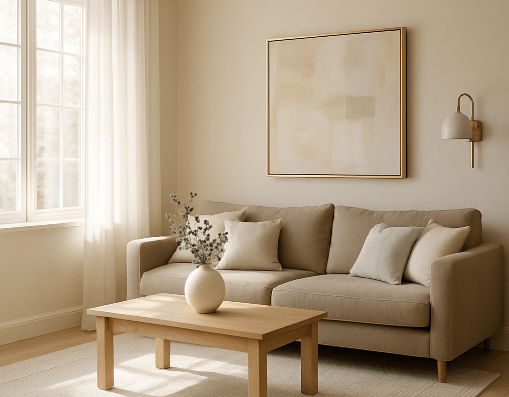
A natural stone countertop adds character to a minimalist kitchen, while a light oak table perfectly matches a light gray sofa. Glazed ceramics catch subtle reflections, enhancing the impression of depth on a neutral background.
Achieving balance in contrasts
The key lies in the hierarchy of tones: you must vary intensity and brightness to avoid a flat look.
- Highlight : choose the darkest shade for an accent wall, a signature piece of furniture, or a prominent frame.
- Light base : off-white or cream cover most surfaces, walls, and ceilings.
- Intermediate : light gray and taupe tie everything together and ensure cohesion.
- Pop of color : a sage green or petrol blue, used sparingly, enlivens the neutral palette.
Example of composition
In a living room, you can paint a main wall in soft slate, dedicate two walls to off-white, and leave the last one in soft taupe. A moss green armchair against this background and a few terracotta cushions complete the picture without breaking the unity.
Common mistakes to avoid
In practice, certain missteps will hinder even the most carefully curated palette.
- Adding too many identical neutrals : multiplying grays of equal value creates a monolithic effect.
- Forgetting soft contrast : an entirely light space lacks impact.
- Ignoring natural light : a north-facing room requires warmer shades to dispel coldness.
- Mixing incompatible undertones : a beige with pink undertones clashes with a wine-gray.
Neutral palette and decorative styles
The same color range can embody a Scandinavian, industrial, bohemian, or contemporary spirit, depending on accessories and finishes.
Revisited Scandinavian
Clean-lined furniture, blonde woods, a few touches of green and leather reveal Nordic softness without falling into the trap of sterile coldness.
Chic industrial
Waxed concrete, brushed steel, and brass pendant lights interact with medium gray walls, offering a raw and elegant contrast.
Light bohemian
Handmade knitting, rattan, and macramé rest on a cream base, creating a warm, almost nomadic decor where each piece tells a story.
FAQ
What is the difference between warm neutral and cool neutral?
A warm neutral leans towards red, orange, or yellow, while a cool neutral contains blue, green, or purple undertones. This distinction affects the perception of the room and the overall ambiance.
How to integrate a touch of color without breaking harmony?
By choosing a shade coordinated with an undertone of your neutral palette (for example, a blue-gray for a light gray wall), you avoid visual shock while injecting character.
Can I use the neutral palette in a small room?
Absolutely. Light tones enlarge the space, and a small dark wall creates depth without shrinking the room. The trick lies in the balance and lighting.
What format should I choose to test colors?
A sample in A4 size or a large cardboard is preferable to evaluate the effect at different times of the day. Small swatches do not do justice to the nuances.
{
“@context”: “https://schema.org”,
“@type”: “WebPage”,
“about”: {
“@type”: “Thing”,
“name”: “Neutral palette”
},
“keywords”: [“neutral palette”,”shades”,”contrasts”,”textures”,”decoration”]
}