/* Css En-Bref */
Digital mapping has transformed the way we perceive space, from smartphone screens to platforms that influence public decisions and business strategies. Yet behind these appealing images lies a set of technical and political choices that steer, intentionally or not, the representation of the world. In this article, we dissect the mechanisms that introduce biases, their concrete effects, and the methods to produce more balanced maps.
Sommaire
In brief
⚡ Data biases: incomplete or outdated sources can distort geographic reality, favoring certain areas to the detriment of others.
🔍 Algorithms and processing: the way information is cleaned, aggregated, or smoothed affects the perceived boundaries and density of a territory.
✅ Geopolitical consequences: a map that distorts borders impacts negotiations, public perception, and migration policies.
📊 Practical corrections: diversifying sources, documenting each processing step, and involving local experts limit distortions.
The roots of bias in spatial representation
1. Data sources: imperfect foundations
Every map starts with a set of data: satellite surveys, geolocation of mobile devices, cadastral databases, field surveys… In reality, these information flows are far from uniform. Rural areas poorly equipped with mobile networks suffer from under-collection of GPS points, while metropolitan areas enjoy hyper-rich surveys. The result? “Less visible” zones that end up blending into the background, relegated to the sidelines.
Moreover, the age of the data can weigh heavily: a cadastre updated twenty years ago does not necessarily reflect the evolution of urban or agricultural landscapes. When comparing different periods without alignment, discrepancies appear – for example, recent neighborhoods missing on some interactive maps. This lack of synchronization creates a temporal bias that distorts reality at the present moment.
2. Algorithms and processing: the reworked map
After collection comes the processing phase: filtering out “noise” (outlier data), statistical aggregation, interpolation between isolated points, generalization of shapes to lighten the display… At each step, an algorithm “chooses” what it keeps, what it modifies, or what it eliminates. In practice, using too much smoothing can erase small watercourses or blur reliefs, and pepper certain territories with moving averages, creating an artificially homogeneous density.
“The devil is in the details,” a cartographer likes to remind us: every parameter decision unconsciously shapes the final perception.
Sometimes, open-source models impose default settings designed for a specific context (dense urban areas, temperate climate…) and do not adapt to other realities, leading to poorly calibrated results in mountainous regions, dense forests, or deserts.
Concrete consequences of cartographic bias
1. Geopolitical perception and diplomacy
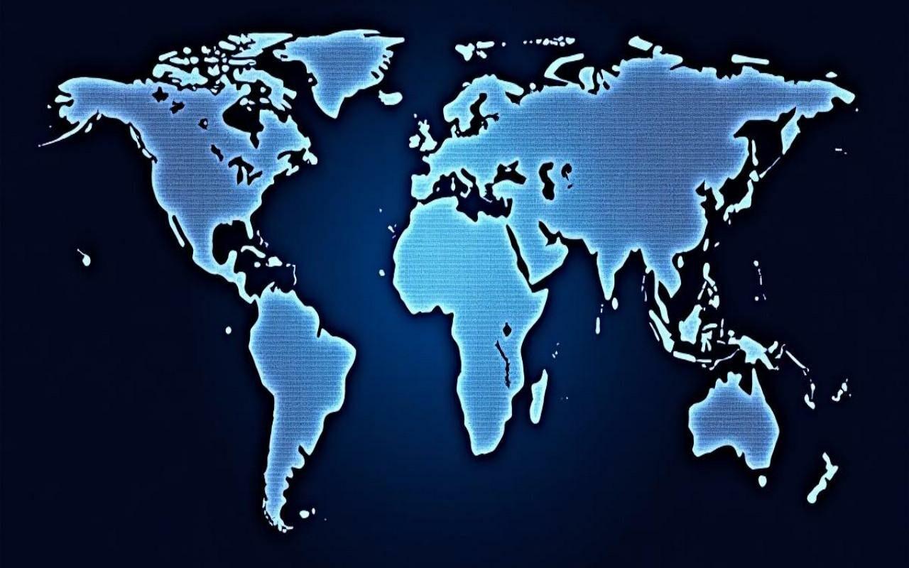
When the representation of a state omits a portion of territory at sea or poorly aligns a border, the public, and even decision-makers, may doubt the legitimacy of a claim. The choice to project the Earth using a Mercator scale or a pseudo-cylindrical equivalent visually exaggerates certain countries at the expense of others, perpetuating unbalanced readings of the global power dynamic.
In a diplomatic arbitration context, these “official” maps sometimes serve as implicit arguments: an altered border tracing can retroactively validate territorial claims. On the ground, the digital image merges with political reality, shaping public opinion and negotiations.
2. Economic and social decisions
Private actors use maps to locate points of sale, optimize logistics, or plan infrastructure. An under-mapped area is less likely to attract investments, penalizing local employment and service development. Conversely, a neighborhood overvalued by very fine data processing sometimes gets flooded with real estate projects, despite unassessed social or environmental needs.
Public authorities rely on maps to allocate aid, manage flood zones, and set protection perimeters. A biased map can mean an overestimation of flood risk in some sectors and an underestimation in others, resulting in authorized constructions where they should be limited.
Summary table of bias types and impacts
| Type of bias | Origin | Major impact |
|---|---|---|
| Sampling | Unequal data by area | Underestimated rural areas |
| Projection | Choice of cartographic method | Surface distortion |
| Processing | Smoothing and interpolation | Erasure of geological details |
| Policies | Variable national standards | Boundary conflicts |
How to detect and mitigate these biases?
1. Good Design Practices
- Multisource: cross-check satellite surveys, open data, and field surveys to diversify perspectives.
- Versioning: keep a history of processing to trace each modification and be able to revert back.
- Geographic calibration: adjust projection algorithms to regional specificities, especially in the mapping of the distribution of agricultural territories.
- User testing: involve geographers, local stakeholders, and citizens to verify the consistency of representations.
2. Transparency and Interdisciplinarity
Documenting every workflow, every source, and every algorithmic parameter becomes essential to provide users with a sufficient level of trust. Embedding this approach within an open data logic strengthens robustness: any observer can scrutinize and question the choices made upstream.
The invitation to interdisciplinary collaborations – geographers, computer scientists, sociologists, legal experts – helps uncover blind spots. Understanding political stakes, social dynamics, and territorial realities ensures a mapping that is more respectful of the nuances on the ground.
FAQ
What is a digital mapping bias?
A bias occurs when the map does not faithfully reflect spatial reality, either due to lack of data or due to choices in processing or projection. Detecting such a discrepancy requires comparing the map to reference sources and analyzing the creation process.
Why are rural data often underrepresented?
Collection technologies (GPS, smartphones, automated surveys) are primarily deployed in urban areas. Rural areas, less equipped, generate fewer measurement points, which diminishes their visibility on interactive maps.
How to identify surface distortion caused by a projection?
Simply overlay the digital map on a globe or use an alternative projection to see size discrepancies. Mercator projections, for example, notably enlarge regions near the poles.
Can a map be made completely “accurate”?
Perfection does not exist, but accuracy can be greatly improved. The key lies in the diversity of sources, transparency of methods, and involvement of local experts to validate each construction step.
{
“@context”: “https://schema.org”,
“@type”: “WebPage”,
“about”: {
“@type”: “Thing”,
“name”: “digital mapping bias”
},
“keywords”: [“bias”, “digital mapping”, “geospatial data”, “algorithm”, “projection”]
}
{
“@context”: “https://schema.org”,
“@type”: “FAQPage”,
“mainEntity”: [
{
“@type”: “Question”,
“name”: “What is a digital mapping bias?”,
“acceptedAnswer”: {
“@type”: “Answer”,
“text”: “A bias occurs when the map does not faithfully reflect spatial reality, either due to lack of data or due to choices in processing or projection.”
}
},
{
“@type”: “Question”,
“name”: “Why are rural data often underrepresented?”,
“acceptedAnswer”: {
“@type”: “Answer”,
“text”: “Collection technologies are primarily deployed in urban areas. Rural areas generate fewer measurement points, which diminishes their visibility.”
}
},
{
“@type”: “Question”,
“name”: “How to identify surface distortion caused by a projection?”,
“acceptedAnswer”: {
“@type”: “Answer”,
“text”: “Simply overlay the map on a globe or use an alternative projection to see size discrepancies, especially towards the poles.”
}
},
{
“@type”: “Question”,
“name”: “Can a map be made completely “accurate”?”,
“acceptedAnswer”: {
“@type”: “Answer”,
“text”: “Perfection does not exist, but accuracy can be improved with diverse sources, transparency, and validation by local experts.”
}
}
]
}