TL;DR: From Ptolemy’s ancient maps to digital planispheres, each era has reinvented the way of representing the world. Advances in measurements, projections, and media have shifted the balance between accuracy, usage, and political vision. Today, GIS, open data, and web mapping democratize cartography while relying on technical and ethical choices.
Sommaire
Definition and Context
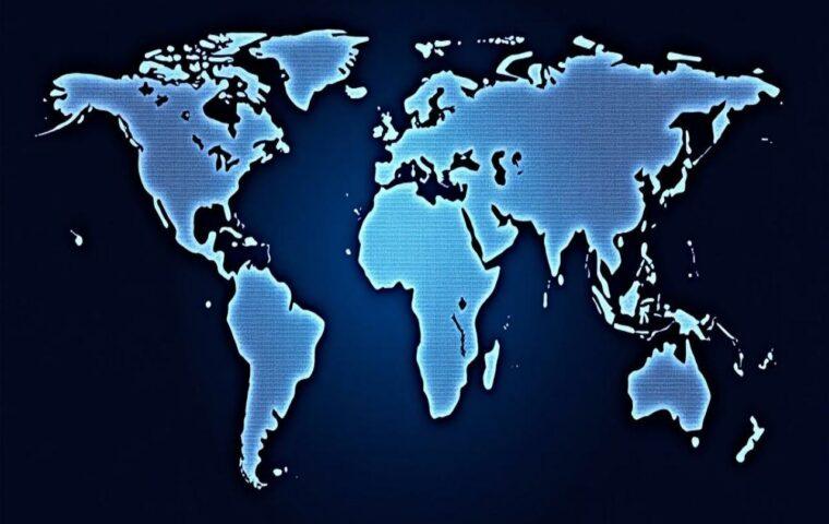
A world map is a flat representation of the Earth’s surface. It requires a geodetic model (shape of the Earth), a projection (transformation of spherical coordinates into planar coordinates), and a graphic language (symbols, colors, toponyms). Every planisphere is a compromise: it is impossible to preserve surfaces, shapes, distances, and directions all at once. Maps therefore reflect scientific, technical, and cultural choices, serving various uses: navigation, education, diplomacy, commerce, science, communication.
Key point: no projection is “perfect.” The right choice depends on the objective: equidistant to measure distances along certain axes, conformal to preserve angles (navigation), equivalent to compare areas (geography, statistics).
The Major Periods of Evolution
Antiquity and Ptolemy’s Legacy
In the 2nd century, Claudius Ptolemy compiled in the Geographia coordinates of places known to the Ancients. His maps, reissued during the Renaissance, proposed mathematical projections and a latitude/longitude framework. They have durably structured European cartographic thought, despite gaps regarding the Americas and Oceania.

Medieval Islamic World and Tabula Rogeriana
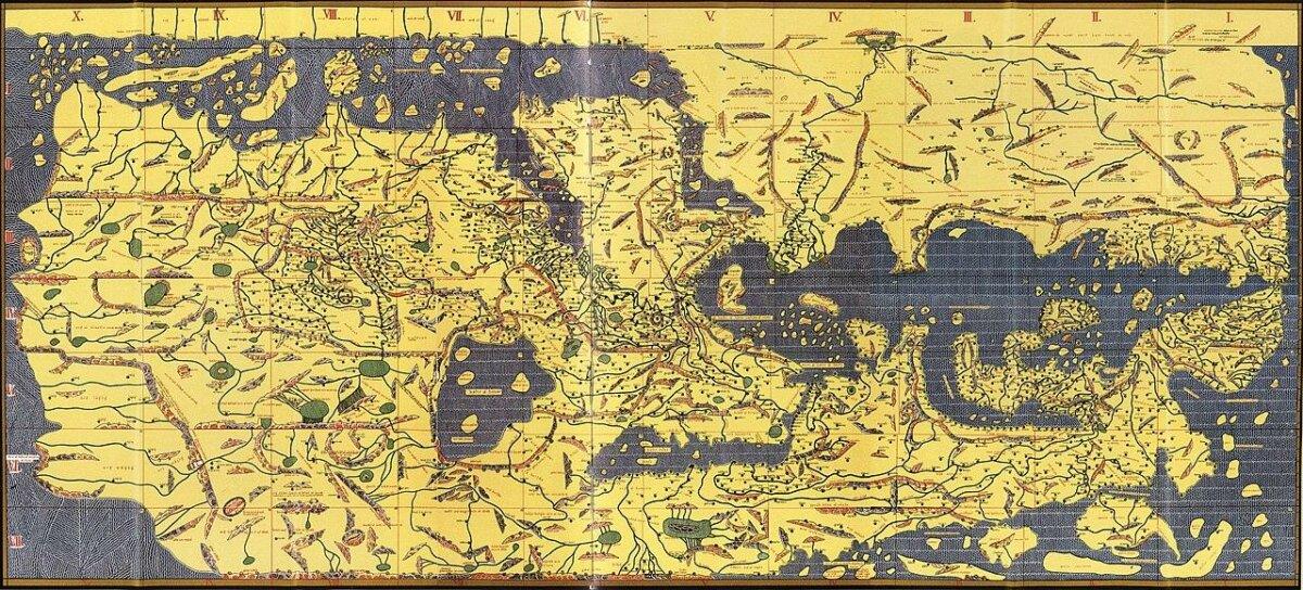
In the 12th century, the Andalusian geographer al-Idrīsī created for Roger II of Sicily a description of the world (Nuzhat al-mushtāq) illustrated by a large map often called the Tabula Rogeriana. The south-up orientation reminds us that orientation is a cultural choice. The rich toponymy and synthesis of Greco-Arab knowledge make it a major medieval reference.
Portolans and Medieval Navigation
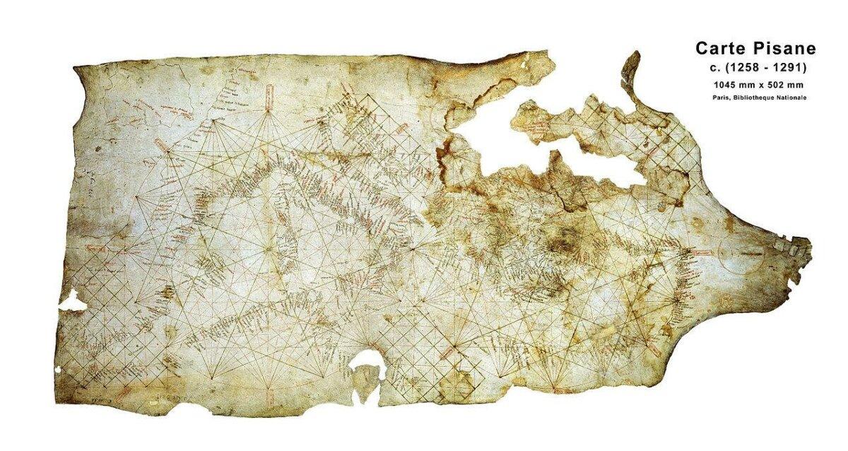
From the 13th to the 15th century, Mediterranean sailors used portolans: nautical charts with networks of rhumb lines radiating from compass roses. Very precise for coasts and capes, these documents served short-range navigation and testify to “practical” cartography.
Renaissance, Printing, and Projections
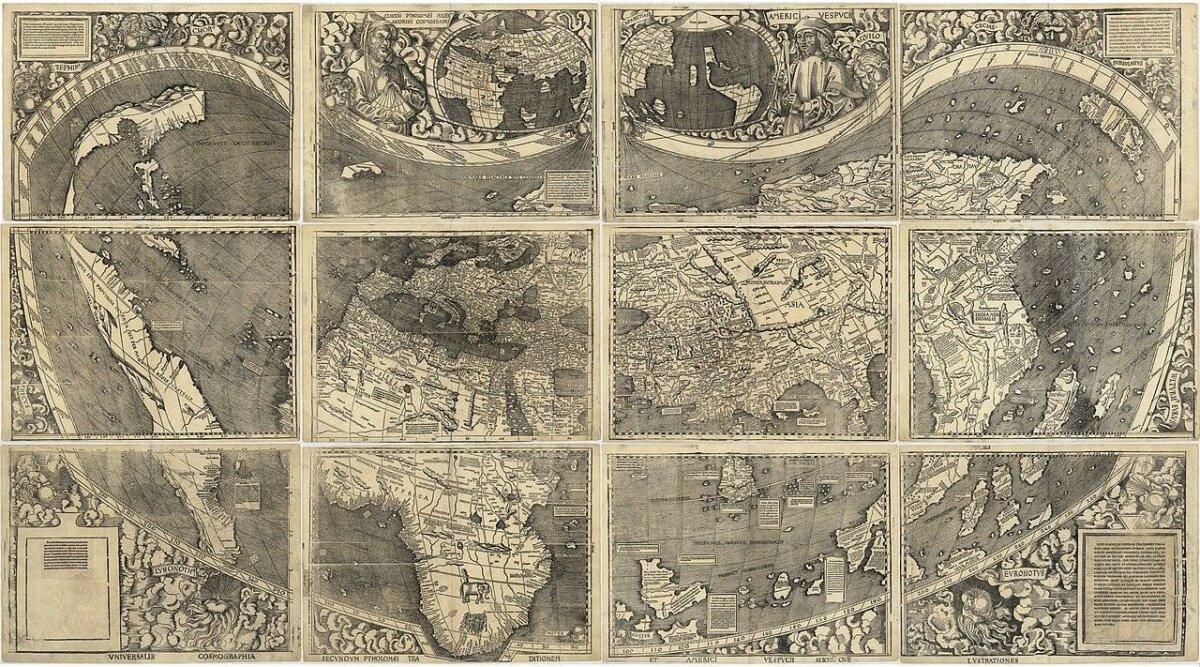
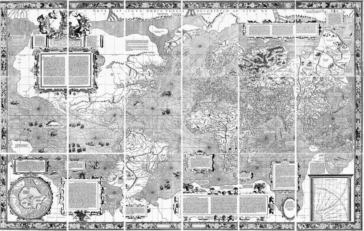
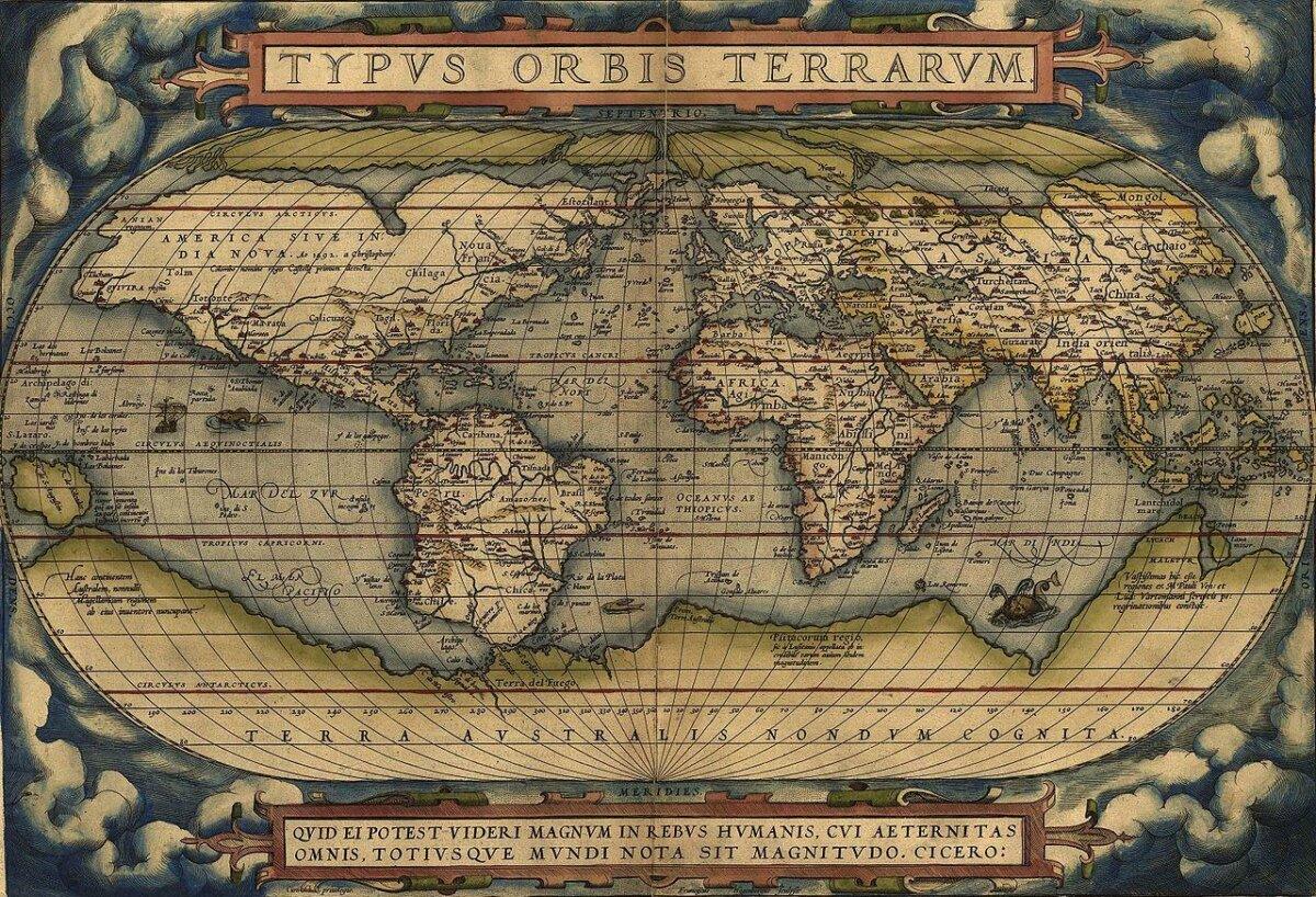
The Great Discoveries and the printing press revolutionize world maps. In 1507, Martin Waldseemüller publishes a wall map in 12 sheets that names “America” for the first time. In 1569, Gerardus Mercator proposes a conformal projection useful for compass bearings: loxodromes become straight lines, facilitating the plotting of constant courses. In 1570, Abraham Ortelius publishes the Theatrum Orbis Terrarum, often considered the first modern atlas.
Modern Period (17th–19th centuries)
Cartography becomes scientific: geodetic measurements, longitudes by marine chronometers, national topographic surveys. World maps diversify: equivalent projections (Mollweide, cylindrical Lambert), globes, hemispheres. Thematic maps emerge: currents, winds, routes, emerging statistics.
20th Century: Projections and Atlases
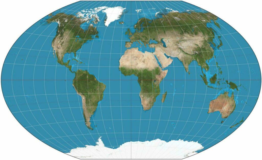
In the 20th century, several compromise projections become standard for school atlases: Robinson (1963) then Winkel Tripel, adopted by many publishers to simultaneously limit distortions of area, shape, and distance. The Peters controversy in the 1970s–1980s popularizes the ideological stakes of mapped surfaces.
21st Century: Data, GIS, and Web
Satellites, GPS, and open data (OpenStreetMap, Natural Earth) feed global mapping portals. GIS (QGIS, ArcGIS) and web mapping often rely on “Web Mercator” (EPSG:3857), close to Mercator and adapted to multi-scale raster or vector tiles. The world map becomes interactive, customizable, and continuously updated. It remains a technical and social construction: choices of layers, projections, place names, display order.
Statistics and Key Maps
| Period | Iconic Map | Main Innovation | Type of Projection / Use |
|---|---|---|---|
| 2nd century (Antiquity) | Geographia by Ptolemy | Geographical coordinates, mathematical frameworks | Various ancient projections / scholarship |
| 1154 (Middle Ages) | Tabula Rogeriana (al-Idrīsī) | Greco-Arabic compilation, south-up orientation | Synthesis map / world description |
| c. 1275–1350 | Mediterranean portolans | Rhumb networks, coastal accuracy | Nautical use |
| 1507 | Waldseemüller | Name “America”, Asia/Americas separation | Printed planisphere / wall map |
| 1569 | Mercator | Conformality, straight loxodromes | Ocean navigation |
| 1570 | Ortelius | First modern atlas | Editorial standardization |
| 1963 | Robinson | Visual compromise for school atlases | Educational use |
| 1998+ | Winkel Tripel | Reduced average error | Generalist atlases |
| 2005+ | Web Mercator | Tiling, multi-scale zoom | Interactive web maps |
Projections: Advantages and Limits
Mercator
- Strength: conformal, angles preserved; constant bearing routes are straight.
- Limit: areas exaggerated at high latitudes; misleading area comparisons.
Gall-Peters (equal-area)
- Strength: accurate areas, useful for global statistics.
- Limit: shape distortion, altered visual perception.
Robinson and Winkel Tripel (compromise)
- Strength: reduced combined errors, pleasing appearance in atlases.
- Limit: neither shapes nor areas perfectly accurate.
Web Mercator
- Strength: computational simplicity, multi-scale consistency, large ecosystem.
- Limit: area and distance distortions, not suitable for global area analyses.
Pro tip: For area comparisons by country, favor an equal-area projection (Mollweide, Eckert IV, Hobo-Dyer). For maritime routes, prefer a conformal projection (Mercator) or calculate great circles.
Examples and Case Studies
Waldseemüller (1507): Naming “America”
Waldseemüller’s planisphere, based on the accounts of Amerigo Vespucci and Portuguese/Spanish explorations, depicts the Americas as a distinct continent and popularizes the name. Its printed distribution illustrates the role of publishing workshops in the circulation of geographic ideas.
Portolans: Pragmatic Performance
Without a rigorous geodetic model, portolans prove very effective for docking. Their rhumb networks reflect open-sea practice based on bearings and sightings, rather than global geometry.
Compromise Projections: Robinson vs Winkel Tripel
The Robinson corrects the visual distortions of Mercator for teaching purposes. The Winkel Tripel minimizes an average of distance, area, and direction errors, which is why it has been adopted by many contemporary atlases.
Understanding Distortion with Tissot
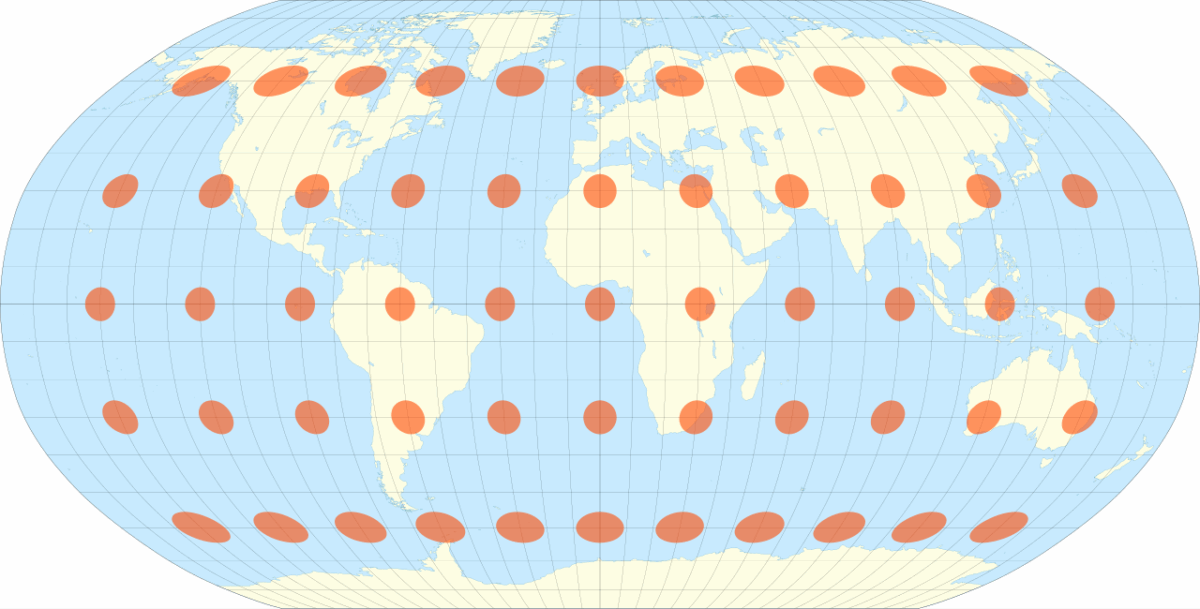
Tissot’s indicatrices, small ellipses distributed over the world map, visualize the intensity and nature of local distortion. As an educational tool, they help choose the projection suited to the message.
Tools, Resources, and Alternatives
- GIS: QGIS (open source), ArcGIS Pro/Online.
- Libraries: PROJ, GDAL/OGR, D3-geo, MapLibre GL, Leaflet.
- Data: Natural Earth, OpenStreetMap, GADM.
- Collections: David Rumsey Map Collection, Library of Congress Maps, British Library Cartographic items.
- Best Practices: choose the projection according to the question, indicate the projection and source, justify toponymy choices, document data updates.
Trends and Future Developments
- Vector tiles and semantic styles: dynamic rendering, thematic accessibility.
- 3D globes and mixed reality: reducing projection compromises in exploration.
- Participatory mapping: OSM and local data to correct blind spots.
- Cartographic ethics: representation of disputed territories, exonyms/endonyms, invisibilization of indigenous peoples.
- Narrative maps: scrollytelling, animations, explicit uncertainties.
FAQ
What is a map projection? A mathematical transformation that projects the Earth’s surface onto a plane. It imposes controlled distortions according to a goal: shape, area, distance, or direction. Why is the Mercator projection still used? For its conformity and simplicity in web tile systems. However, it is not suitable for comparing global areas. Which projection should be chosen to compare countries? An equal-area projection (Mollweide, Eckert IV, Gall-Peters, Hobo-Dyer) to preserve surfaces. What is the “first” map to name America? The Waldseemüller world map (1507) is the first known map to use the name “America” and to clearly distinguish the Americas from Asia. Were portolan charts accurate? Very precise for Mediterranean and nearby Atlantic coasts. They were not designed for global measurements of areas or distances. Why do some maps have south at the top? Orientation is a cultural convention. The Tabula Rogeriana by al-Idrīsī places south at the top, other traditions place east on the right, etc. What is the Tissot indicatrix? A visual tool that shows, in the form of ellipses, how a projection locally distorts distances and shapes. The more the ellipse deviates from a circle, the stronger the distortion.
Reliable Sources
- Library of Congress — Waldseemüller Map (Universalis Cosmographia): loc.gov
- Encyclopædia Britannica — “Map projection”: britannica.com
- International Cartographic Association — Resources on projections: icaci.org
- Wikimedia Commons — Tabula Rogeriana: commons.wikimedia.org
- Wikimedia Commons — Mercator 1569: commons.wikimedia.org
- Wikimedia Commons — Ortelius 1570: commons.wikimedia.org
- Wikimedia Commons — Carta Pisana (portolan): commons.wikimedia.org
- Wikimedia Commons — Tissot indicatrix (Robinson): commons.wikimedia.org
- Wikipedia — Winkel Tripel projection: en.wikipedia.org
- David Rumsey Map Collection — Online collections: davidrumsey.com
- British Library — Introduction to Portolan charts: bl.uk