What exactly is meant by sports mapping in France?
A sports mapping in France does not only mean a map of stadiums or gyms. It aggregates facilities, practices, access, sometimes clubs and user flows, in order to show how the sports offer is distributed from one territory to another and under what conditions it is actually accessible.
The first trap is to mix several objects under the same label. One map may list swimming pools, multisport halls, football fields, dojos, or tennis courts. Another may show clubs, licensees, or digital solutions related to sport. Yet these layers do not answer the same questions. A mayor wants to know where to invest. A parent wants to find where to enroll their child. A club rather looks at the pool of practitioners and local competition.

The most useful database for reasoning at the national level remains the Sports Facilities Census, used by the Ministry of Sports and widely taken up in local diagnostics. It allows comparing families of facilities, but on the condition of distinguishing what belongs to the site, the facility, and the actual use. This is where the reading becomes interesting, and sometimes counter-intuitive.
For the general public, the most meaningful sports mapping is often thematic. A map of padel courts in France responds, for example, to an immediate practice need, just as a map of family ski resorts better illuminates mountain territories than a general multisport database.
What exactly do the figures for sports facilities count?
The figures do not always count the same thing. Depending on the datasets, they add up sites, individual facilities, or separate installations at the same address. Comparing two territories without checking this method is like comparing apples, pears… and sometimes an entire complex with a single tennis court.
In a municipality, a sports complex can include a gymnasium, an athletics track, several outdoor fields, and changing rooms. Depending on the classification used, it may appear as a single site or as multiple installations. That is why it is always necessary to read the methodology before commenting on differences between departments or intermunicipalities.
The most reliable reference point is to cross public classifications with field observations. The report relayed by Bookcity provides a useful national scale, but this figure only makes sense if one specifies what is included: local facilities, large stadiums, indoor pools, specialized halls, or outdoor spaces.
Counting more facilities does not automatically mean better serving the population.
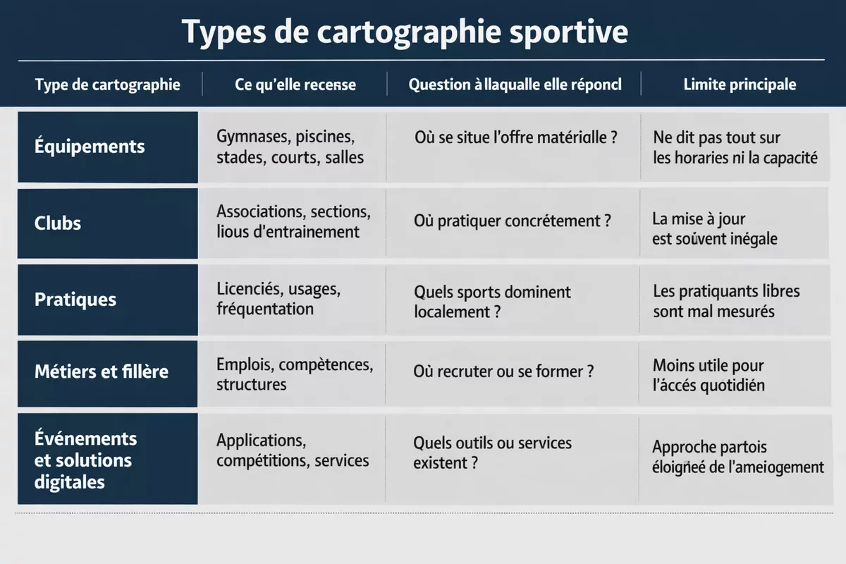
To clarify things, several families of sports mappings can be distinguished, which are often confused in search results:
| Type of mapping | What it records | Question it answers | Main limitation |
|---|---|---|---|
| Facilities | Gymnasiums, swimming pools, stadiums, courts, halls | Where is the material offer located? | Does not say everything about schedules or capacity |
| Clubs | Associations, sections, training locations | Where can you actually practice? | Updates are often uneven |
| Practices | License holders, usage, attendance | Which sports dominate locally? | Unorganized practitioners are poorly measured |
| Professions and sector | Jobs, skills, structures | Where to recruit or train? | Less useful for daily access |
| Events and digital solutions | Applications, competitions, services | What tools or services exist? | Approach sometimes distant from planning |
Why is a territory that is well-equipped on the map not necessarily the best served?
Because a territory is judged both by its volume of facilities, its population, the necessary travel, and the usage pressure. A large metropolis can concentrate many sites while remaining saturated. Conversely, a rural department may seem well-equipped per inhabitant but require long journeys to access a swimming pool or a specialized hall.
The clearest example is density. According to INSEE (2024), Paris far exceeds 20,000 inhabitants per km², while Creuse is around 20 to 25 inhabitants per km². With such a disparity, adding up facilities without relating the numbers to the population or travel time means almost nothing. A raw map flatters quantity; a territorial analysis measures actual access.
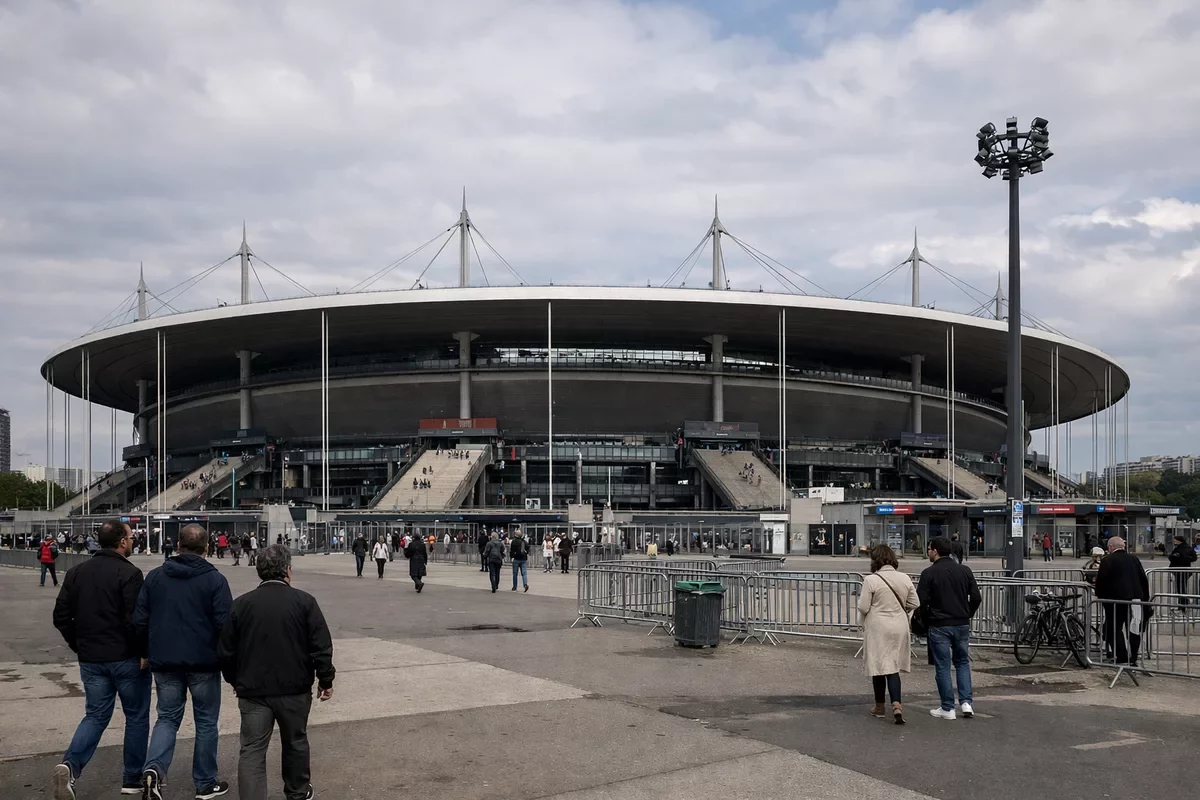
In Saint-Denis, the Stade de France perfectly illustrates this ambiguity. On a national map, such a massive facility gives the impression of a territorially very strong sports presence. In everyday life, however, this type of infrastructure mainly serves specific event, school, or federation uses; it does not replace a neighborhood swimming pool or a gym freely accessible to local clubs.

Conversely, in Creuse, Lozère, or certain intermunicipalities of Cantal, it is observed on the ground that a well-located multisport hall can provide more service than a territory rich in scattered facilities. The map must therefore be read with a simple question: how many people can actually use these facilities, at what distance, and with what scheduling constraints?
A territorial agent notes that, in several rural municipalities, the issue is not the total absence of facilities but the versatility of a few sites. The same hall hosts school PE, handball, gymnastics, senior associations, and sometimes community events, creating an invisible tension on a static map.
How to correctly read territorial data on a sports map?
The correct reading consists of crossing four filters: the type of facility, the population served, the access time, and the intensity of use. Without this cross-reference, the map remains illustrative. With it, it becomes a very concrete decision-making tool for a municipality, an association, or a consulting firm.
In other words, a good French sports cartography does not just place points. It prioritizes. An indoor swimming pool, a shooting range, a main stadium, and a city stadium do not have the same cost, audience, or frequency of use. The territorial data must therefore be interpreted on several levels:

- The stock of equipment: how many facilities exist in the territory?
- The structure of the offer: which sports are overrepresented or underprovided?
- Accessibility: how many minutes does it take to reach the relevant facility?
- Usage pressure: are the time slots really available for residents and clubs?
This logic also applies to mobility. In a peri-urban area, a facility may be close “as the crow flies” but difficult to access in the evening or on weekends. That is why a cross-reference with a carpooling area map or with a map of rapid charging stations on highways can become useful for competitive practices or major interclub trips.
A sports map is not a record of achievements: it is a tool to understand who has access to what, at what distance, and under what conditions.
In practice, residents of peri-urban rings often tell the same story: the offer exists, but it forces a trade-off between car, school hours, and travel time. This is an essential point, because a facility open only during very restricted time slots may count in a statistical database while remaining of little use on a daily basis.
What the numbers really show according to territorial profiles
When comparing territories, four main profiles almost always come up: dense metropolitan areas, suburban rings, rural areas, and tourist or mountain zones. The same indicators do not tell the same reality in each of these cases. That is why national comparisons need to be recontextualized, not just aligned in a ranking.
In Marseille, for example, the Orange Vélodrome symbolizes the power of a major urban facility. But as in Saint-Denis, its presence does not exhaust the subject: for daily practice, residents mainly judge the availability of neighborhood gyms, swimming pools, multisport courts, and shared school facilities.

In Haute-Savoie or the Hautes-Alpes, the reasoning changes again. Facilities related to winter sports, leisure centers, and seasonal infrastructures weigh more heavily in the local economy, but they do not always compensate for the lack of indoor halls for the annual use of residents. It is the same nuance found between a residential, tourist, or university territory.
To simplify the reading, here is the type of interpretation that works best:
| Territorial profile | What the map often shows | What needs to be checked additionally | Risk of error |
|---|---|---|---|
| Dense metropolis | Many concentrated facilities | Usage pressure, saturation, actual availability | Confusing abundance with ease of access |
| Suburban | Dispersed but visible offer | Travel time, dependence on car | Underestimating mobility constraints |
| Rural | Few sites, but sometimes good ratio per inhabitant | Versatility, condition of facilities, distance | Overestimating actual accessibility |
| Mountain or coastal | Specialized or seasonal facilities | Annual use, local public, operating cost | Confusing tourist attractiveness with daily service |
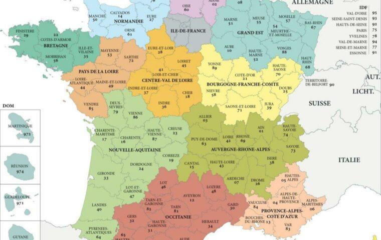
This reading is all the more useful as France has 101 departments and very strong differences in population, relief, and urban structure. Between a dense municipality in Île-de-France, an intercommunal structure in Gers, and an alpine resort, raw comparison quickly reaches its limits. According to the IGN (2023), departmental sports maps make all the more sense when they cross-reference facilities and territorial profiles rather than when they merely show a general total.
The Limits of Sports Maps: What Not to Infer from Them
A map, even a well-made one, can never replace local investigation. It does not always indicate if a facility is outdated, undersized, reserved for schools, closed for several months, or too expensive for some families. It also does not reveal whether the local club has enough time slots or if demand is exploding due to a recent population increase.
This is where field feedback becomes valuable. A family who arrived in 2022 in a rapidly growing municipality often shares the same experience: on paper, the sports offer seems adequate; in reality, waiting lists lengthen registration delays, especially for swimming, gymnastics, or indoor sports. The numbers remain useful, but only if linked to actual usage.
To avoid misunderstandings, it is better to follow a few simple rules:
- Compare homogeneous categories of facilities, not an undifferentiated total.
- Relate the facilities to the population and, if possible, to the relevant age groups.
- Take into account the access time, especially in suburban and rural areas.
- Check the update date of the database used.
- Complement the map with local observations on time slots, condition, and usage.
In other words, sports facilities never speak for themselves. They must be read alongside local demographics, mobility, school organization, and sometimes even seasonality. In rapidly growing living areas, tension does not always appear in raw figures. Conversely, a stable territory may have fewer facilities but use them better thanks to effective intercommunal organization.
The best approach is therefore to treat the map as a starting point. According to the Ministry of Sports and the public datasets released in recent years, the strength of mapping is not to “rank” departments once and for all, but to identify where a facility is lacking, where another is overused, and where simple pooling could already improve the service provided.
Key Takeaways
📍 A useful sports map crosses facilities, population, access, and intensity of use.

📊 The number of sports facilities varies depending on the counting method used.
🚗 A rural area may be well-equipped on paper but difficult to access.
🏟️ A large stadium improves the image of a territory, not necessarily daily practice.
🧭 Territorial data are most valuable when interpreted alongside field knowledge.
FAQ
Can a municipality appear well-equipped while residents lack available time slots?
Yes, this is quite common. A municipality may have several facilities in the public database, but a large portion of the schedules may be reserved for schools, competitions, or a few already saturated clubs. The raw number does not always measure actual availability.
How to compare two departments without making mistakes?
Simple total comparison should be avoided. The most robust method is to look at the number of facilities by type, relate it to the population, then incorporate access times and population density. Without these filters, the comparison is often biased.
Do sports maps take private facilities into account?
Not always, or not in the same way depending on the databases. Some fitness centers, private fields, or corporate infrastructures may be absent or only partially listed. For a local assessment, it is therefore necessary to supplement the public map with on-site verification.
How often are territorial sports data updated?
The frequency depends on the database consulted and the local information feedback. Public datasets are regularly updated, but there can be a delay of several months between the opening, closing, or renovation of a facility and its appearance on the map. This is a point to check before any investment decision.
Are these data used only by municipalities or also by clubs?
They are used by both. A municipality sees it as a planning tool, while a club can use it to identify a practice area, a local shortage, or an under-equipped zone. For an association, it is also a good way to support a request for a time slot or equipment.