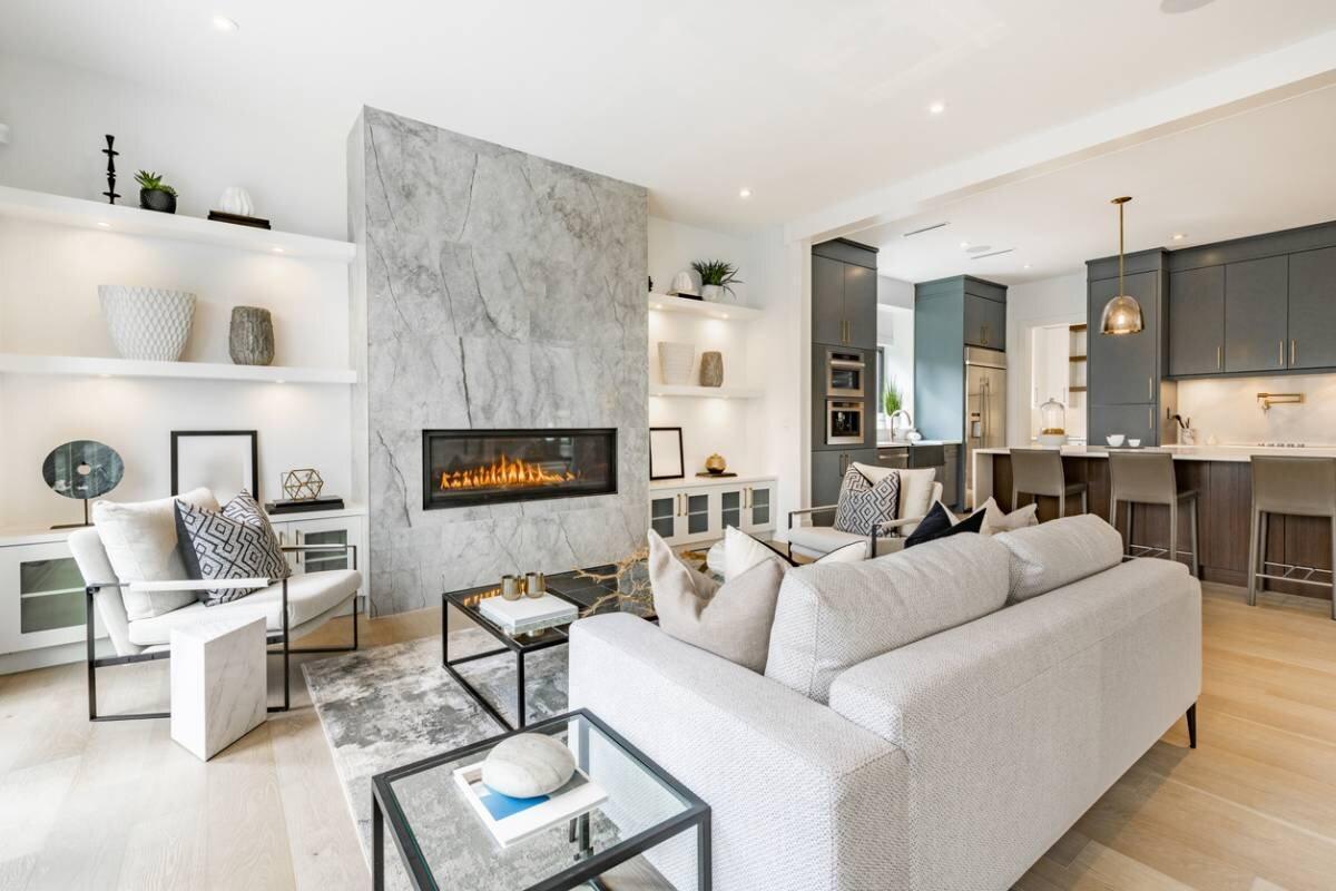
Setting the foundations for a truly coherent interior design
A successful interior design project begins long before the purchase of a sofa or wall paint. It is born from an overall vision that takes into account the desired style, the uses of each room, and the specific constraints of the space (volumes, orientation, circulation, etc.). Without this preliminary framework, choices accumulate without logic and a patchwork effect sets in. The first step is to identify a unifying element capable of guiding all future decisions. This unifying thread can be a light wood floor that runs through several rooms, a neutral shade repeated on the walls, or a structuring piece of furniture around which the decoration is organized. The idea is not to homogenize but to create a visual continuity that gives coherence to the whole.
Take the example of an open living room connected to an entrance. If the floor remains the same in both spaces and the color palette shares at least one common shade, such as an off-white on the walls, for example, the transition happens naturally, without overloading the decoration. The eye moves freely from one space to another. Moreover, an interior design thought out on the scale of the entire house rather than room by room in isolation helps avoid visual breaks. This global vision also prepares the selection of a color palette coherent with the available light and the volumes of each space.
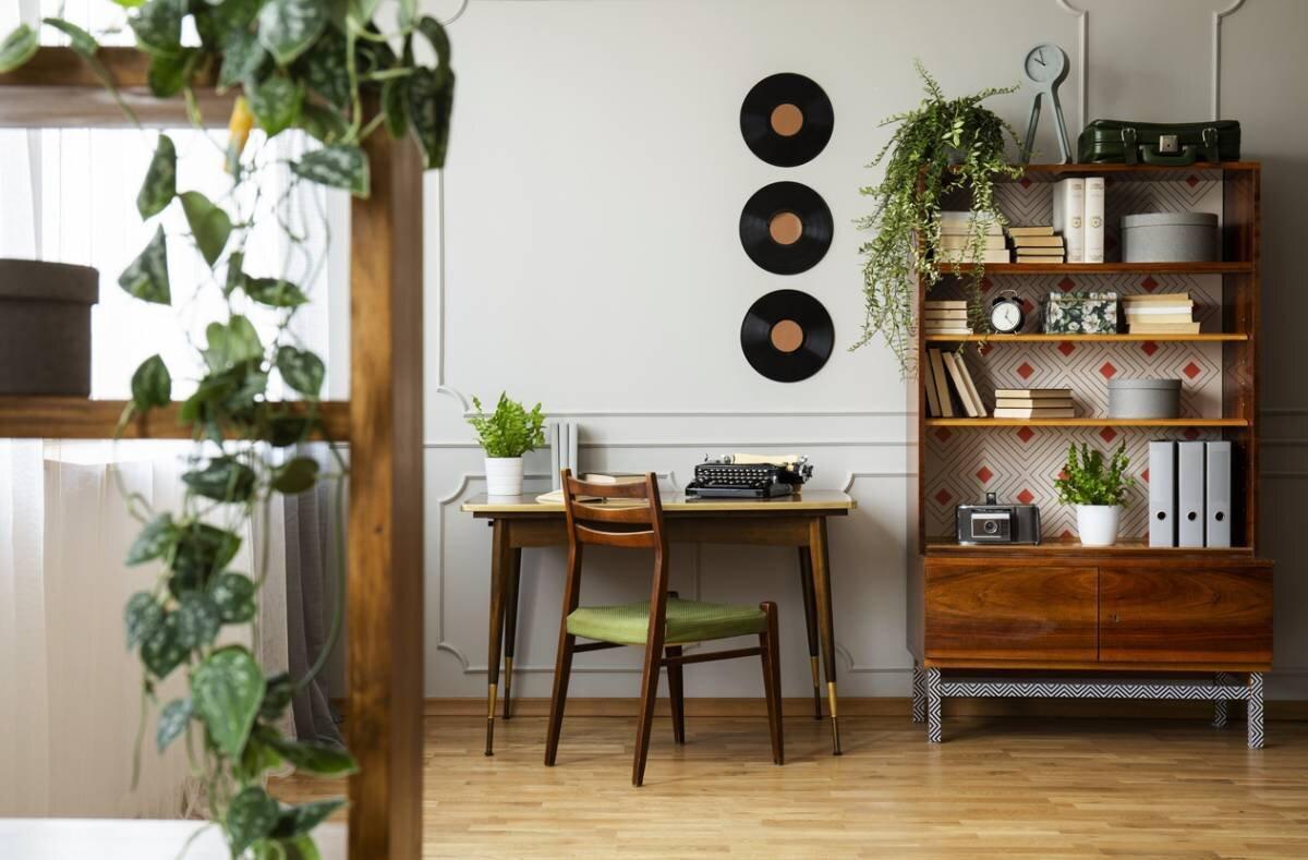
How to choose a color palette suited to the room?
The color palette of a room is not chosen on a whim in front of a swatch. It is built according to a three-level logic, namely a neutral base, secondary shades, and accents. The neutral base (white, beige, or gray) occupies the majority of surfaces: walls, floor, main furniture, etc. It creates the visual breathing space necessary for any balanced decoration. Secondary shades then bring character without dominating the space.
Finally, accents punctuate the room with more assertive touches of color, carried by cushions, lighting fixtures, or decorative objects. Color also affects the perception of volumes. Light and cool shades tend to visually enlarge a space, while warm and deep tones tighten it and give it intimacy. In a very bright living room, a palette of whites and warm beiges creates, for example, an airy atmosphere.
In a darker room, however, it is better to avoid shades that are too cold which accentuate the cellar effect and prefer golden neutrals or discreet ochres. Regarding materials, natural wood warms up a palette of cool neutrals. Textiles soften contrasts, while metal, depending on its finish, brings sharpness or sophistication. Choosing materials coherent with your color palette is already half the work done.
Key materials to link floors, walls, and furniture without overloading
Materials are the true binders of a successful interior decoration. They create continuity between the floor, walls, and furniture and give each room its emotional texture. A few families of materials deserve to be known for their specific effects:
- wood brings warmth and naturalness: present on the floor, as wall covering, or in furniture, it unifies spaces without weighing them down,
- stone and concrete introduce a raw mineral quality that structures the ambiance and contrasts well with soft textiles,
- textiles (linen, cotton, and velvet) soften volumes and make the space more welcoming,
- metal and glass create precise visual accents, useful to energize a decoration that is too tame.
The balance between dominant material and accent materials is also the key to a readable decoration. A dominant material, such as light wood, occupies large surfaces. One or two accent materials then complement it without competing. In a living room, the combination of a light wood parquet floor, neutral textiles (natural linen or ecru cotton), and a few black touches (lamp base, frame, furniture handles, etc.) produces, for example, a sober and contemporary harmony. Finally, light, natural or artificial, profoundly modifies the rendering of these materials and shades.
Mastering light to reveal shades and textures
Light transforms everything. The same color on a wall can appear warm and enveloping in the morning, cold and dull late in the afternoon. Understanding this phenomenon well allows you to avoid unpleasant surprises during installation or painting. Natural light varies according to the orientation of the room and the time of day. A north-facing room receives cold and stable light, which can bluish light shades. A south-facing room benefits from warm and changing light, which warms whites and beiges. These variations directly influence the perception of the chosen palette.
Artificial light adds another layer of complexity. Its color temperature determines whether it leans towards cold white or warm yellow. Lighting with a low color rendering index can distort shades and make materials look dull. Choosing lighting adapted to the desired ambiance is therefore as important as choosing the right paint. A warm white on a wall, combined with a light wood floor, creates, for example, a soft and luminous coherence in a well-exposed room. The same white, under cold lighting, can appear grayish and lose all its effect. Testing shades in real situations, at different times, remains the best way to avoid contrasts that are too strong or too dull.
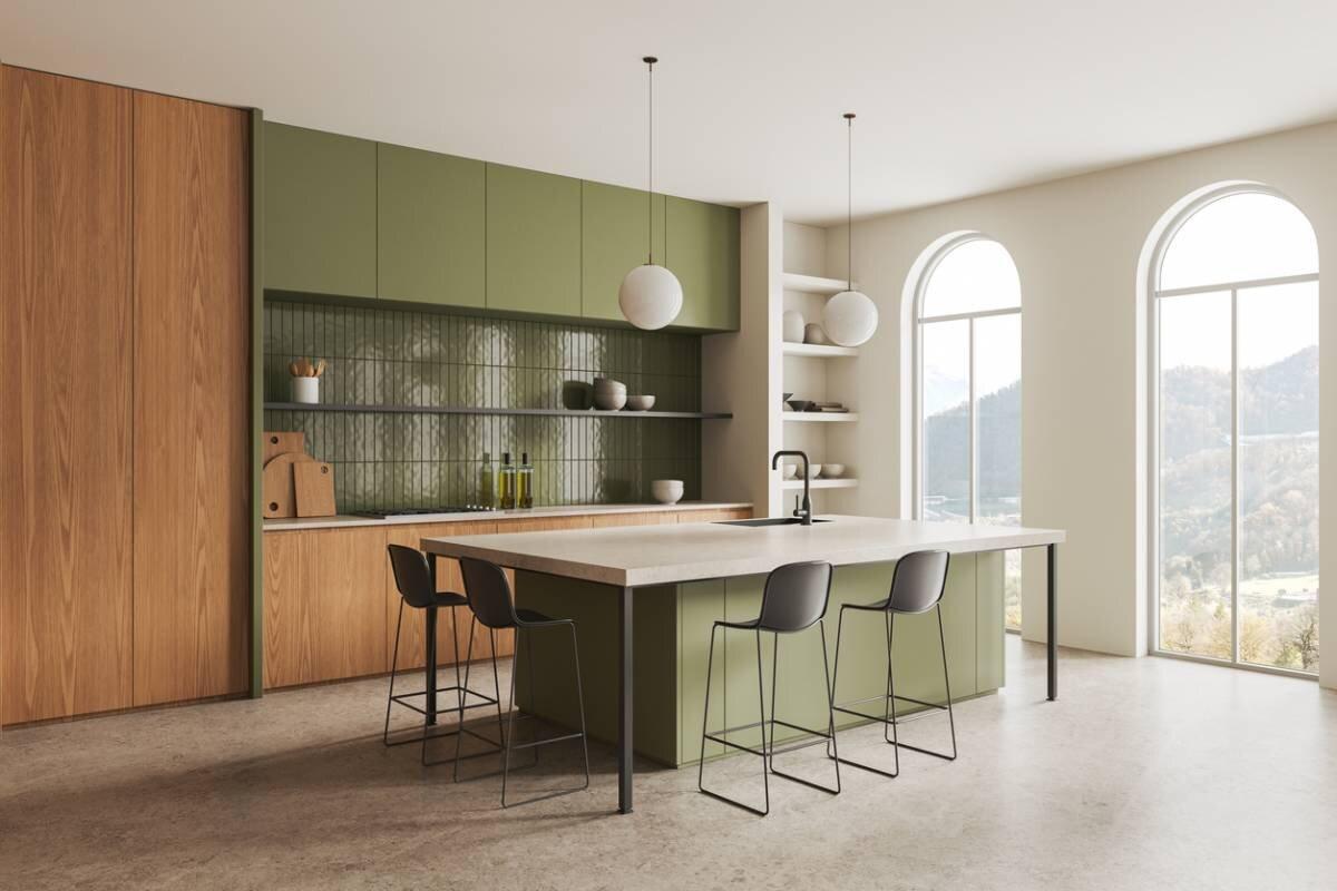
What guidelines to keep to avoid tasteless mistakes?
Certain mistakes regularly recur in interior decoration projects. Identifying them allows you to circumvent them without sacrificing the personality of the space. The most common mistakes are as follows:
- too many strong colors in the same room, creating a restless atmosphere,
- a mix of woods with too different tones (light oak, dark walnut, yellowed pine, etc.) that breaks visual coherence,
- poorly placed contrasts, such as a very dark floor under very light walls without transition,
- an accumulation of patterns on textiles, wallpapers, and rugs, which saturates the eye.
To avoid these mistakes, limit the palette to two or three colors per room. Also, choose a dominant material and add only one or two as accents to avoid overload. Repeating the same shade or material in several places in the room also creates visual reminders that unify the decoration. Finally, when an ambiance seems too cluttered, the correction does not necessarily require a major renovation. Removing a few objects, replacing colorful textiles with neutrals, or repainting a single wall in a softer shade can be enough to restore balance.
A simple method to harmonize every space in the house
To harmonize your interior, first observe the natural light of the room at different times to understand how it transforms shades. Then choose a neutral base for large surfaces (walls, floor, and main furniture). Next, select one or two main materials that will set the tone of the ambiance. Add color or material accents to personalize the space without overloading it. Finally, check the coherence between rooms to ensure the house forms a readable whole.
Coherence between spaces does not mean uniformity, however. It is rather about creating discreet reminders: the same wood shade on the floor in the entrance and living room, an accent color that reappears in the bedroom in a different form, a style of lighting fixture repeated from one room to another, etc. These invisible threads give the home its own character. To validate the overall harmony, nothing replaces tests in real situations. Placing paint samples on the wall, arranging floor or textile samples in the room, taking photos at different times: these simple steps prevent costly regrets. The eye needs to see materials and colors together, in their real context, to judge their coherence.
Merging materials and colors coherently is above all a matter of method and observation. Starting from a neutral base, choosing complementary materials, and taking into account the light specific to each room makes it possible to create an interior decoration that lasts over time. Tests in real situations remain the best safeguard against unpleasant surprises. Every space in the house deserves this attention, not to make it perfect, but to reflect a coherent and personal vision.