Origins and Editorial Choices
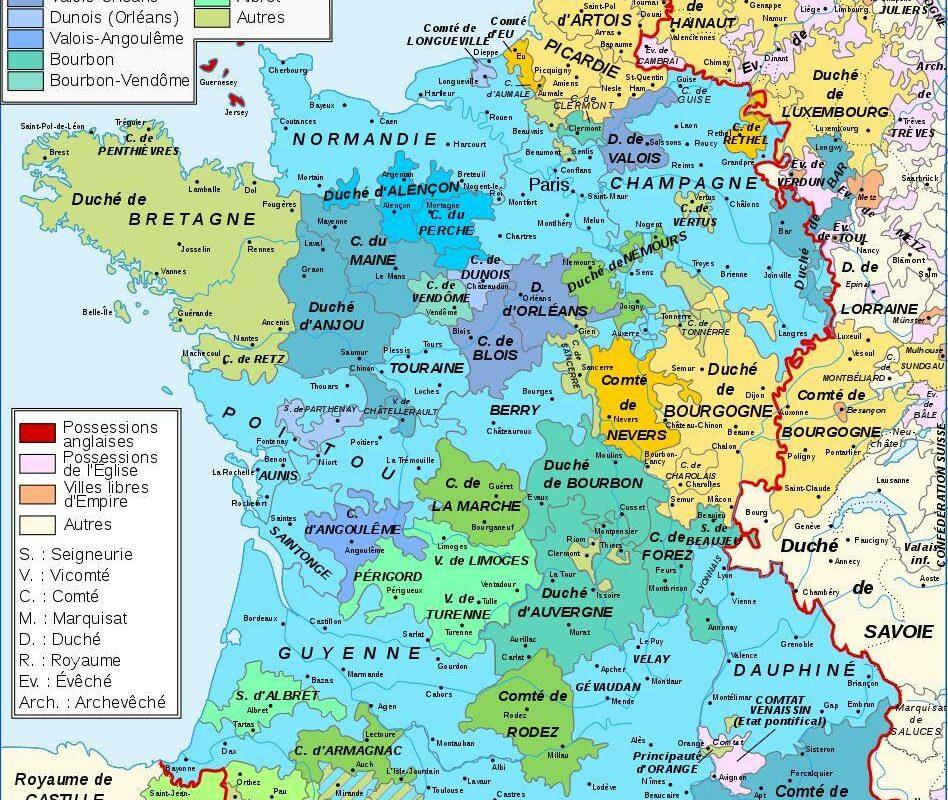
Each map is born at the crossroads of a commission, a targeted audience, and material constraints. Under the Ancien Régime, cartographers often worked for the royal power, tasked with consolidating its grip on the territory. State workshops received sometimes contradictory surveys, which they had to unify into clear images. The result: an “official” map where consideration of local realities fades behind royal geometry.
In the 19th century, the rise of color printing introduced the notion of visual hierarchy. Cartographers adopted palettes to differentiate provinces, departments, and language zones. Implicit preferences slipped into these chromatic choices: border regions often received cool tones, reinforcing the idea of internal stability and external threat.
Cartographers’ Decisions
Far from being mere artisans of geographic surveying, cartographers continuously questioned their sources. Like Nicolas Sanson in the 17th century, they compared medieval manuscripts, travel reports, and emerging cadasters. They weighed trust and coherence, sometimes at the cost of subjective judgments. Departmental workshops, then the National Geographic Institute (IGN), imposed their own doctrine: standardize landmarks for the army, administration, and education. This standardization erases regional peculiarities in favor of a centralized reading.
Behind the scenes, debates erupted: should medieval spellings of names be preserved or should contemporary French forms be adopted? Some publishers insisted on picturesque vocabulary to appeal to the general public. Others, more scientific, favored toponymic precision even if it discouraged laypeople. This tension between aesthetics, pedagogy, and didactic rigor feeds the biases still noticeable today.
Political Bias and Territorialization
Maps are far from neutral. They materialize the will of a state or a pressure group. When the Revolution electrifies Europe, cartographers serve a new narrative: France, the epicenter of liberty, ideally extends where revolutionary ideas spread. Natural borders like the Rhine are sometimes exaggerated to reinforce the idea of a people “united by the soil.”
Influence of the Central State
From the Consulate onwards, Napoleon I launched ambitious cadastral surveys. The primary goal? Tax collection. But cartography also became a tool of legitimation. Recent campaigns describe an annexed territory, many maps display front lines where victory is imprinted on paper. Later, the prefectural administration standardized department boundaries, removed enclaves, and adjusted river borders to simplify management. A superficial reading forgets that these adjustments primarily aimed at public order and taxation.
When the army calls on the IGN to trace routes, it also decides on the scale and framing. The banks of the Loire or the Pyrenean passes then receive a level of detail that is lacking in less strategic areas. This partiality stems directly from imperial or republican needs, rather than a concern for historical fairness.
Traces of social and cultural history
One might think that maps merely indicate borders and reliefs. In truth, they reflect cultural choices: places of worship, dialects, manufactures, or trade routes. As early as the 18th century, atlases included pictograms to signal the vineyards of Bordeaux, the saltworks of Lorraine, or the fairs of Champagne. These symbols reveal an economic and social vision, sometimes more interesting than simple political delimitation.
As an illustration, a CNRS historian points out that the Cassini map, a major reference, bears the mark of its time: the castles of the rural nobility are meticulously represented, while poor villages disappear. This is evidenced by the hamlet of Launay, now vanished, absent from the detailed maps, excluded by the map’s scale. It is the coalition of aristocracy and science that shapes a selective geography. This “geography of the powerful” continues to dominate our school textbooks.
Consequences on the perception of the past
When studying the French Revolution, one often relies on maps illustrating the spread of Jacobin ideas. These representations give the impression of uniform adherence, whereas federalist or royalist songs were in full swing in vast regions. Young researchers use local cadastral plans to reveal a more nuanced picture: zones of resistance, revolutionary strongholds, private correspondence networks. The generalized map, even if precise, can mask the diversity of experiences.
In tourism as well, cartographic bias shapes behaviors. Guides praise the Loire castles route or the Cathar trail before pointing out more modest treasures. This selection directs visitor flows, favors certain economic sectors, and disrupts territorial planning. Critics and defenders clash: does the cartographer’s art lie in enhancement or in absolute neutrality? The answer varies according to editorial ambitions.
How to identify and correct these biases?
- Compare several eras: juxtaposing maps from 1650, 1850, and 1950 reveals successive evolutions.
- Cross-reference with written sources: travel journals, private correspondence, notarial deeds.
- Check the scale: many details hidden at 1:500,000 appear at 1:50,000.
- Consult local surveys: departmental archives and cadastral plans provide a finer view.
- Analyze the legend: some symbols may imply bias (variable pictogram sizes).
For those wishing to deepen the question, the section dedicated to the most beautiful High-quality Maps of France offers concrete examples of maps from the 18th to the 20th century, accompanied by critical annotations.
FAQ
Why do old maps omit certain villages?
Cartographers adjusted the level of detail according to scale and objectives – military, fiscal, or educational. Less important hamlets could be left out to avoid overloading the map.
How to distinguish political bias in a map?
One must examine the legend, compare with maps from opposing sides, and cross-check with contemporary testimonies. If a border region is systematically emphasized, there is a strong chance that a political agenda is at work.
Which institution publishes the most neutral maps today?
The National Geographic Institute (IGN) strives to offer balanced representations, but each map responds to a specific need: hiking, urban planning, or historical research.
{
“@context”: “https://schema.org”,
“@type”: “WebPage”,
“about”: {
“@type”: “Thing”,
“name”: “bias of historical maps of France”
},
“keywords”: [“historical maps”,”cartographic bias”,”history of France”,”cartography”]
}